For our school projects we are not quite concerned about making our apps look pretty but rather meeting the requirements and hitting the core concepts. Eventually, though, you would and should want to deploy one or all of your apps to showcase your work. That is when you might want to work on the way your app looks as this could be one such case where looks matter. So, I decided to work on deploying my app that I built for the final project at Flatiron School - the first stop being its responsiveness.
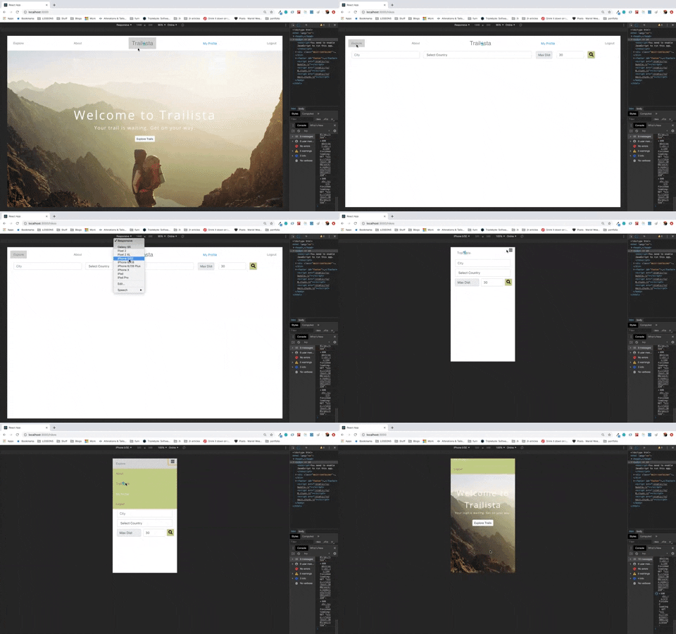
With the increasing variety of devices we use nowadays to access contents on the web, it makes sense to architect our app’s design to adjust to varying media types, screen/viewport sizes and such, providing a good user-experience that we as developers strive for. I used Chrome’s Responsive Web Design Tester Tool to simulate different viewport dimensions of devices such as iPhone 5/SE, iPad and laptops, to get the idea of how my app looks on different screen sizes. However, everytime I switched between viewports other than a laptop’s, I cringed at the way my app looked. For instance, on iPhone 5’s viewport, my search form that otherwise so nicely stretched across the page now broke into two rows with the input boxes unattractively stacked on top of each other. The letters in the navbar were gigantic in proportion to the viewport size, and my app just did not look neat and finished anymore. So, I decided to turn to media queries.
Media queries are powerful tools lent by CSS3 to alter the way the content of the app adjusts to the device type, viewport/screen size and orientation.
These tools allow us to tell our program to apply certain CSS rules if the specific conditions are met.
The basic syntax for media queries consist of the keyword @media followed by media type and expression(s).
@media < media-type > and (expression) {
     /* CSS rule for styling ...*/
}
Media Types
The available media types are:
all- includes all devicesprint- used for displaying content in print-preview modescreen- includes mobile, tablet, and desktop devicesspeech- intended for speech synthesizers
We are usually concerned with screen. So, to target screen media types we could write something like:
@media screen and (expression) {
/* CSS rule */
}
Logical Operators
Logical operators can be used to separate or combine more than one condition.
-
and- Usingandrequires media feature expressions on both sides of the keyword to return true in order for the media query to return true. It is also used to join media type with media features. -
or- Also, written as a comma (,) only requires one of the comma-separated conditions to return true for the entire media statement to return true, thereby triggering the media query to apply. -
only- Requires the entire condition to match in order for CSS to apply. It comes in handy during situations where you want to hide media queries from older browsers and likenot, must come at the beginning of the declaration followed by media type. -
not- Negates a media query, returning true if the query would otherwise return false.
Expression
We use this part of the code to target media features, such as width, height, resolution, etc.
For example, the query below will target the width media feature and for any device with viewport width of 425px, the content inside p tag will be red.
@media and screen and (width: 425px) {
    p {
     color: red;
	}
}
We can also use min-width and max-width variants to query minimum and maximum values, respectively. For example, the query below will apply to any device with viewport width between 0 and1024px.
@media screen and (max-width: 1024px) {
    p {
     color: blue;
	}
}
And, voila!! there you have a responsive app. Of course, you can build complex media queries depending on the complexity of your app but hopefully this basic knowledge of media queries will get you started on your journey to master building responsive web apps.
Finally, here’s a snippet of what my app looks like now in varying viewport sizes:
